


St Philips Church
Annual Report / Rebrand
Publication Design / Re-brand / Not for-profit
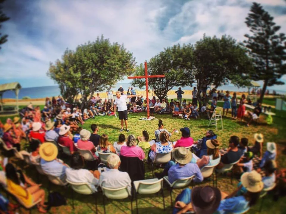
St Philips Cottesloe is a thriving church community in coastal Western Australia, with a strong focus on families and discipleship.

Branding for Growing Communities
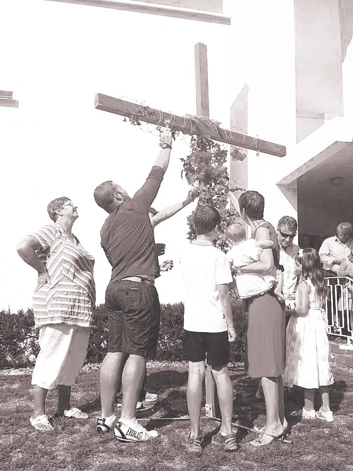
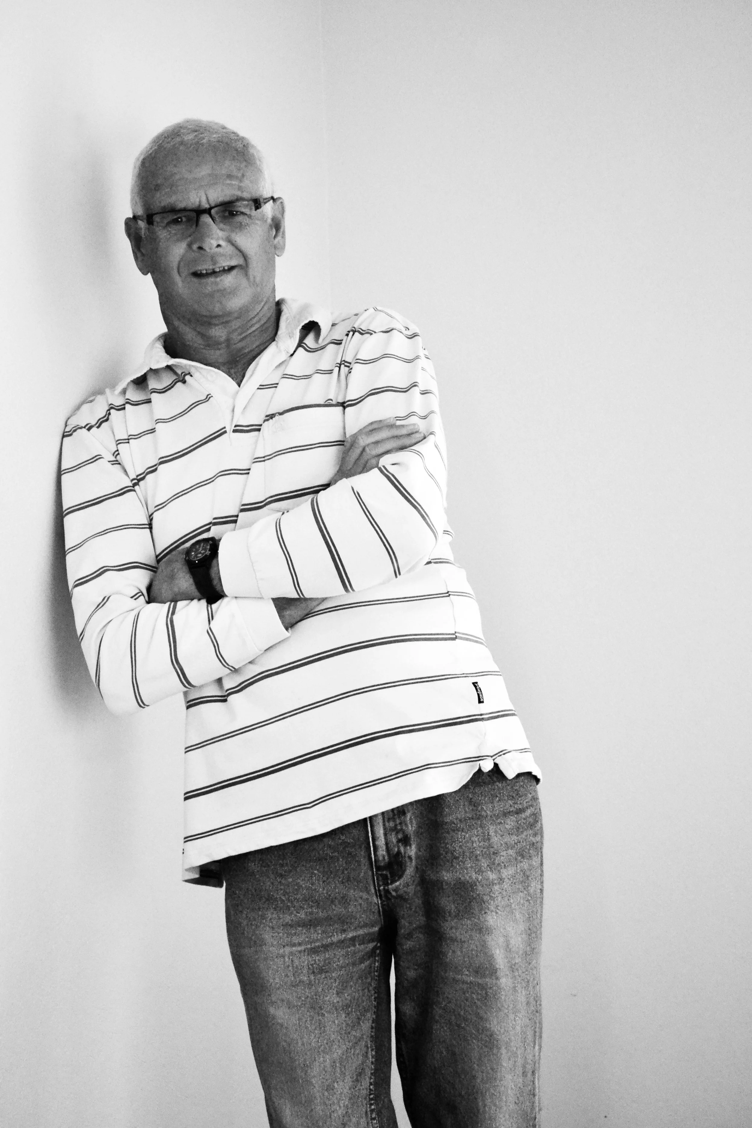
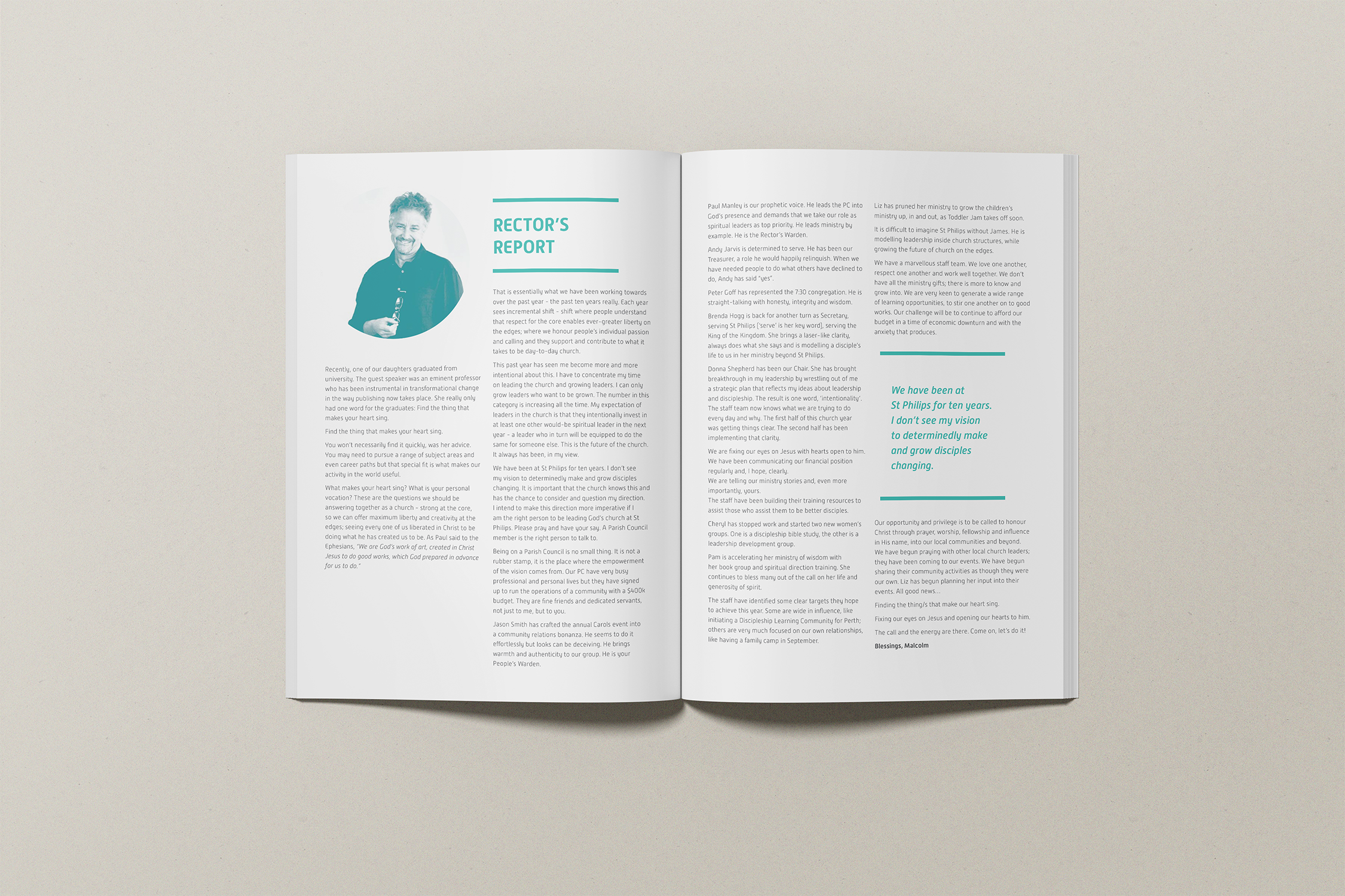
Churches are communities first. Multi-generational. Multi-faceted. Built on people. Volunteers, ministries, programs, and events all contribute to a rich and diverse ecosystem.
The Challenge
The challenge was to create a unified brand system strong enough to anchor the whole system, yet flexible enough to allow each ministry and age group to express its personality.
The Solution
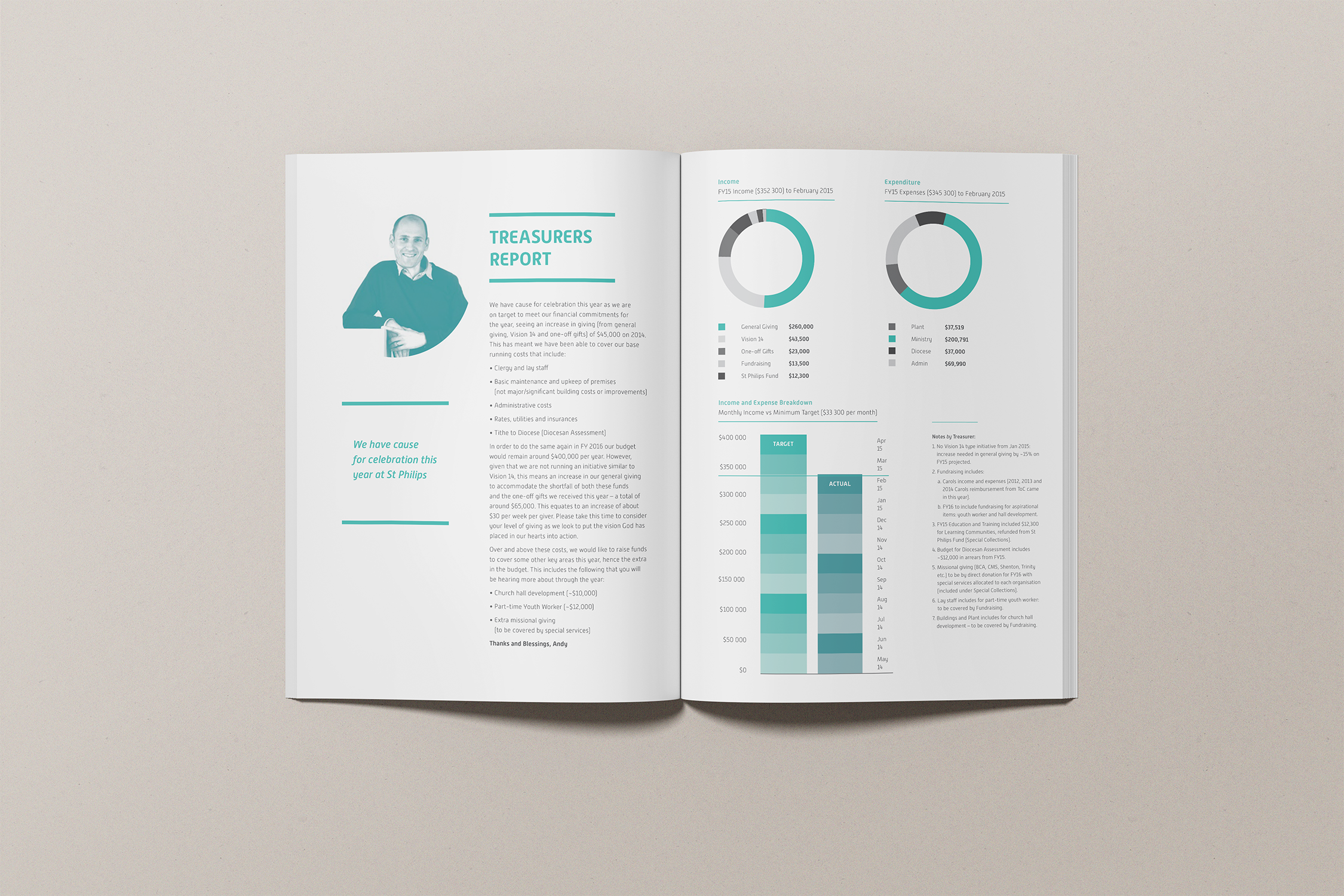
The answer was found in the location. Cottesloe’s coastal setting, along with its predominantly baby boomer demographic, informed a palette that feels warm, refined and quietly confident. Coastal tones meet clean, corporate structure. Approachable, but not casual. Established, but not dated.
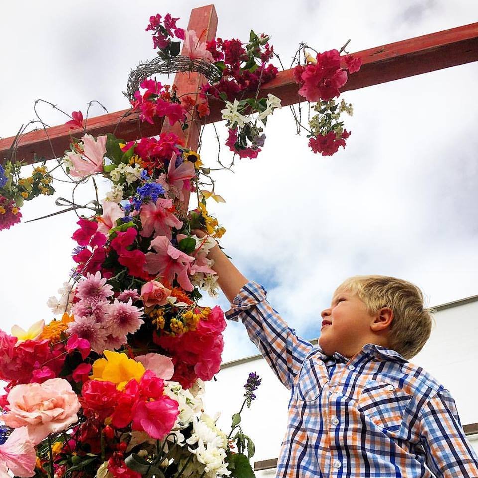
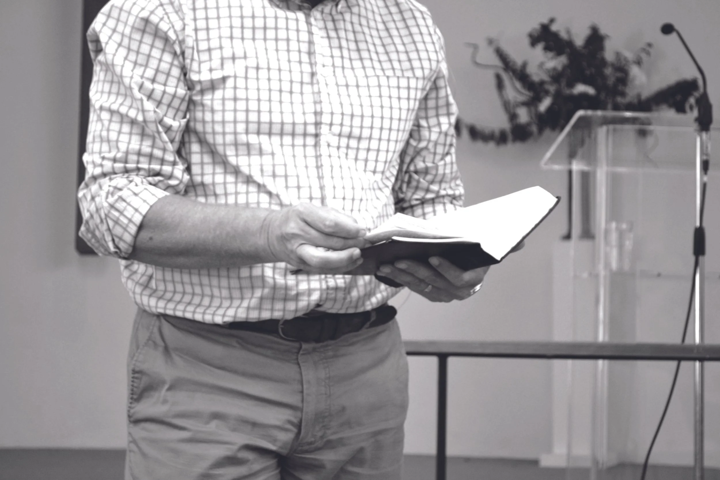
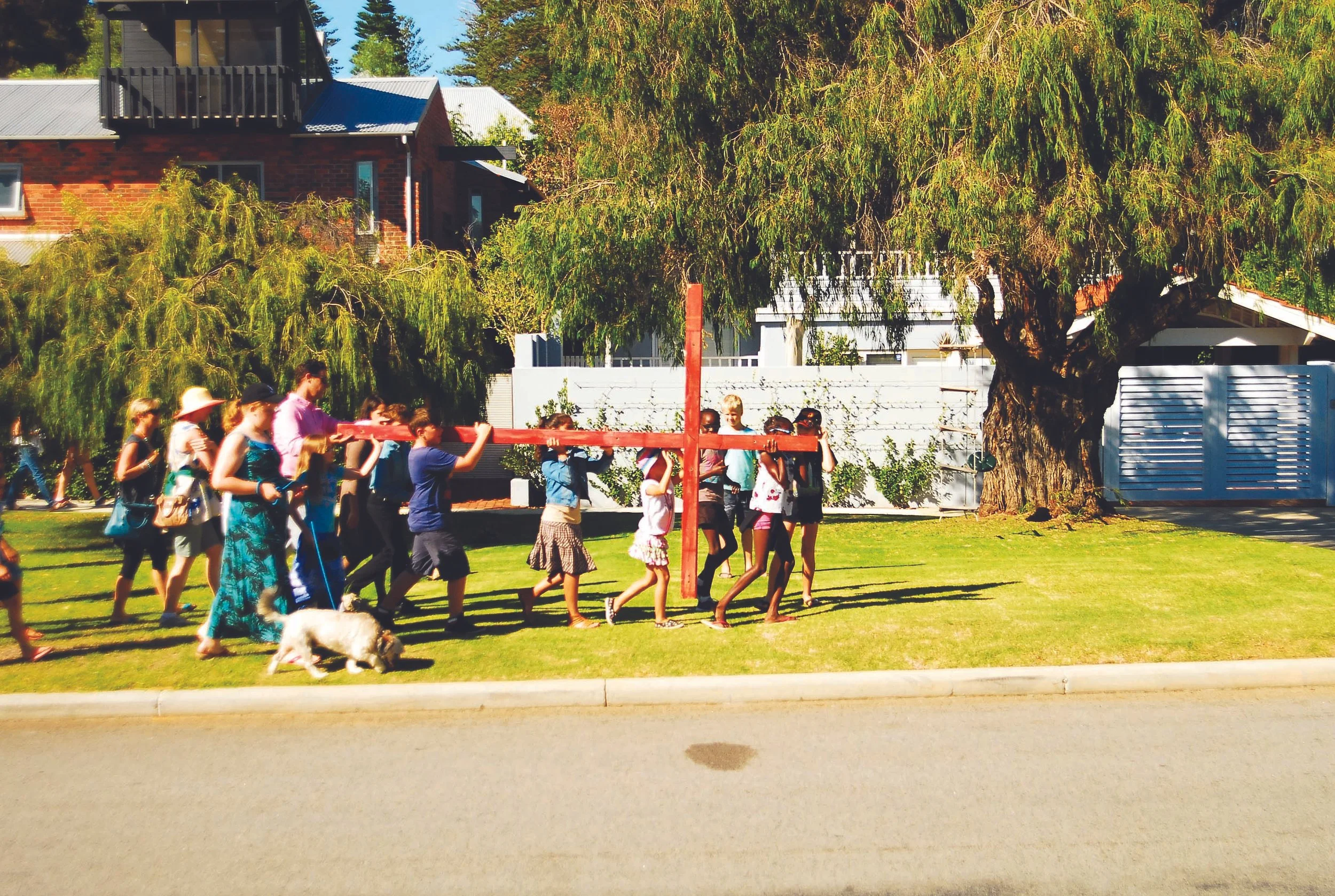
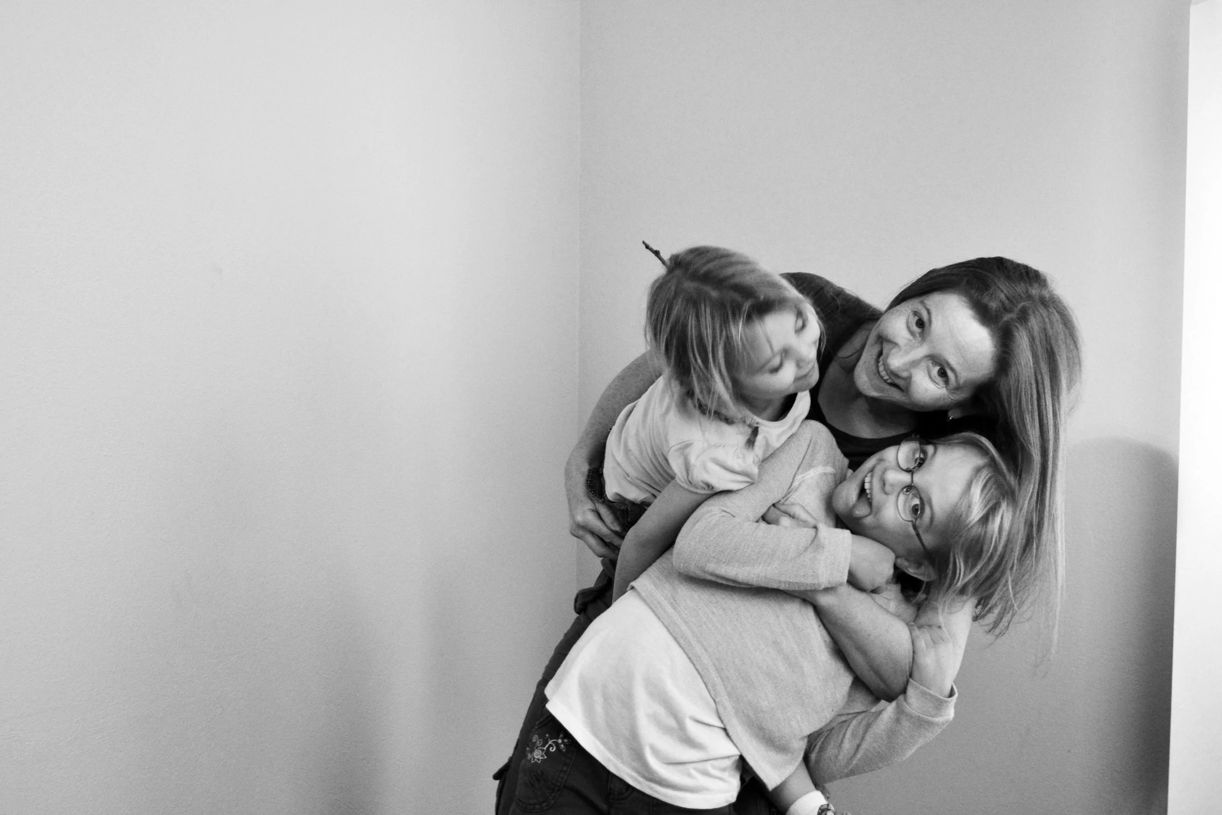
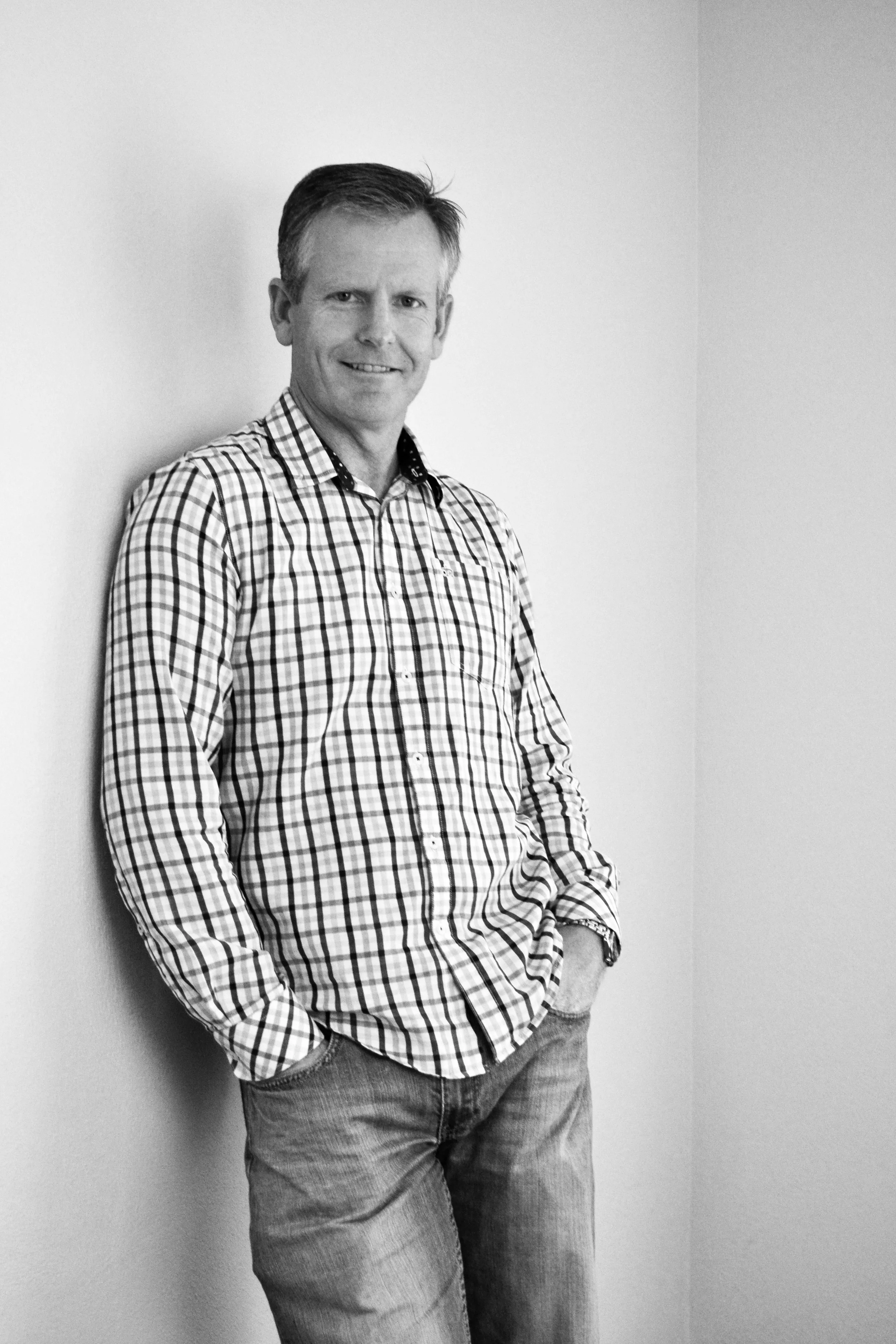
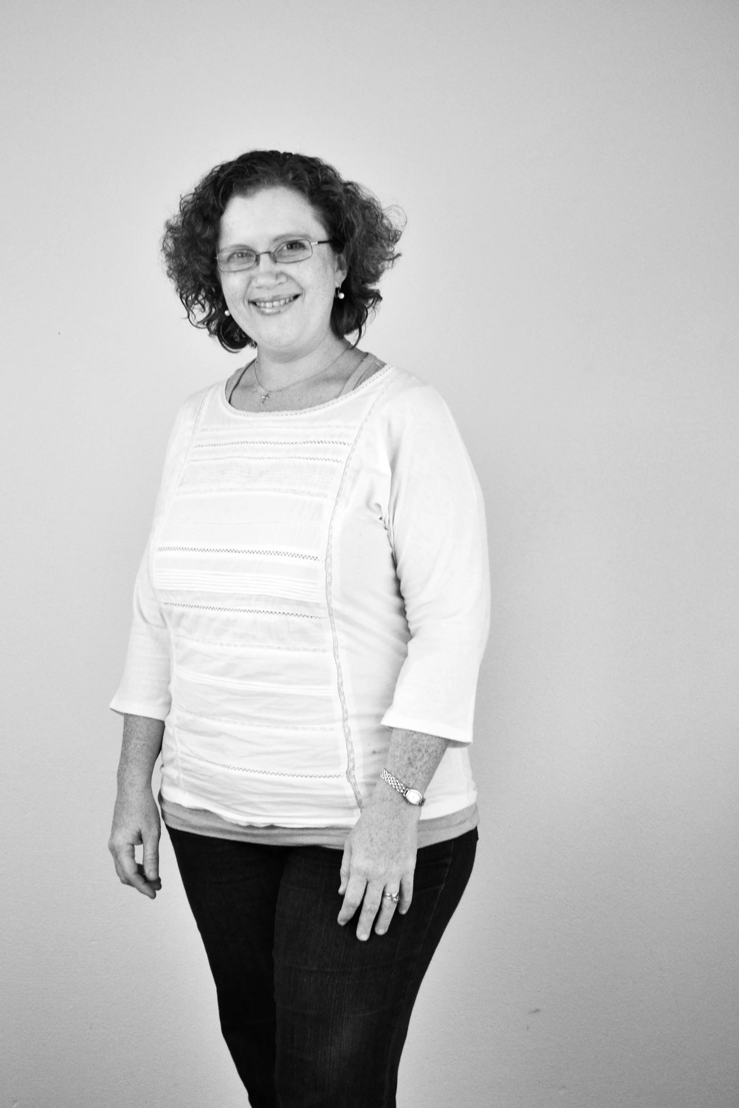
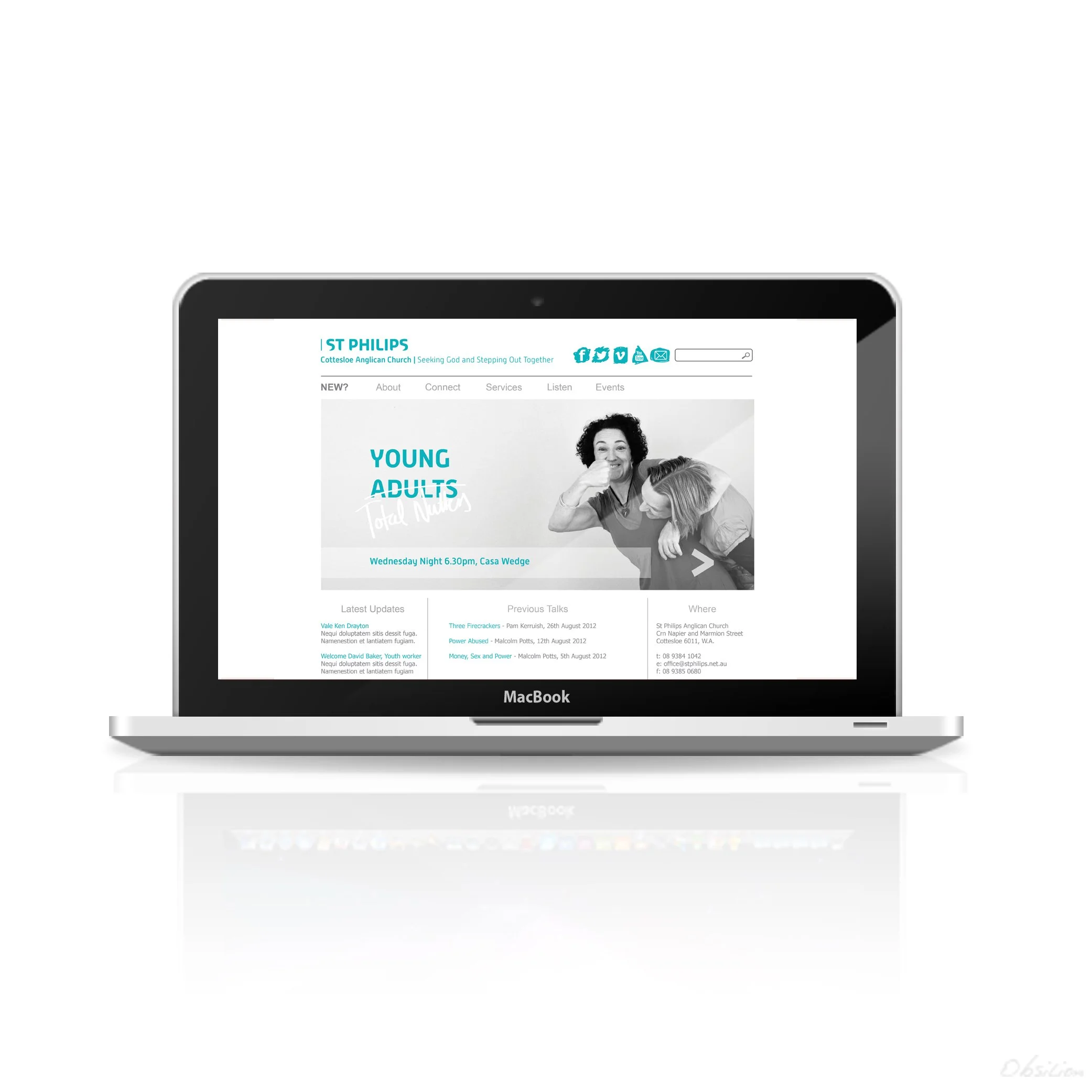
The visual system was designed for accessibility and consistency. Professional photography sits comfortably alongside iPhone imagery, unified through simple tonal treatments such as warmth or monochrome. This allows anyone contributing content to remain on brand.


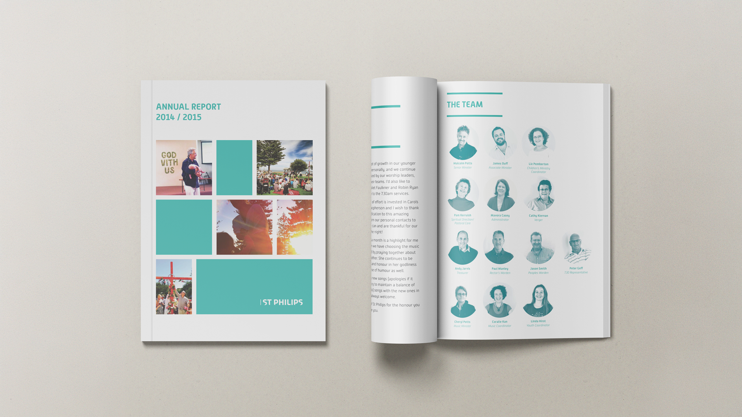
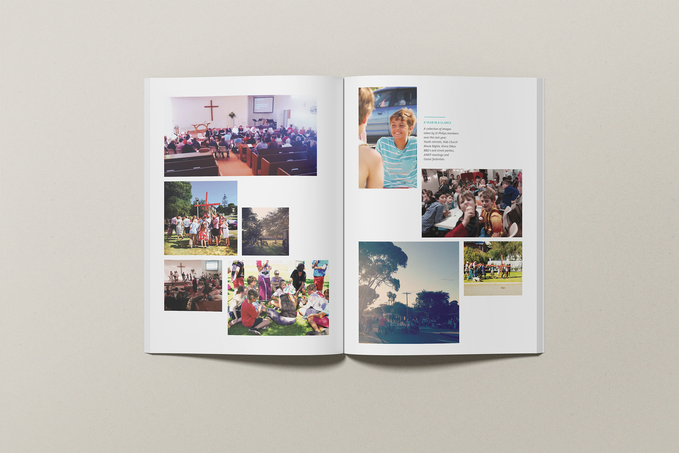

What was delivered
-
Though always vibrant, the church was able to utilise it’s more cohesive strategy to improve communication, online touchpoints and campaigns.
-
Internal and external marketing materials were streamlined, creating greater clarity, unity and trust.
This lead to a rise in engagement, especially in younger demographics, as well as empowering the existing community.
-
Professional, streamlined communication contributed to significant growth in mission-led activity and engagement.
A brand built for real-world use. And built to last.
As a growing not-for-profit, St Philip’s needed a brand system that could work hard without heavy oversight. Managed across limited budgets, multiple stakeholders and volunteers, the identity had to be practical, intuitive, and resilient.
We built a visual system designed to flex. Structured enough to protect brand integrity. Open enough to allow personality, diversity, and community expression.
Launched in 2013, the rebranding continues to perform. Through leadership changes and generations of families moving through the church, the foundations have held strong.