Think Pink Breast Cancer Foundation
Brand Refresh / Website / Not for-Profit
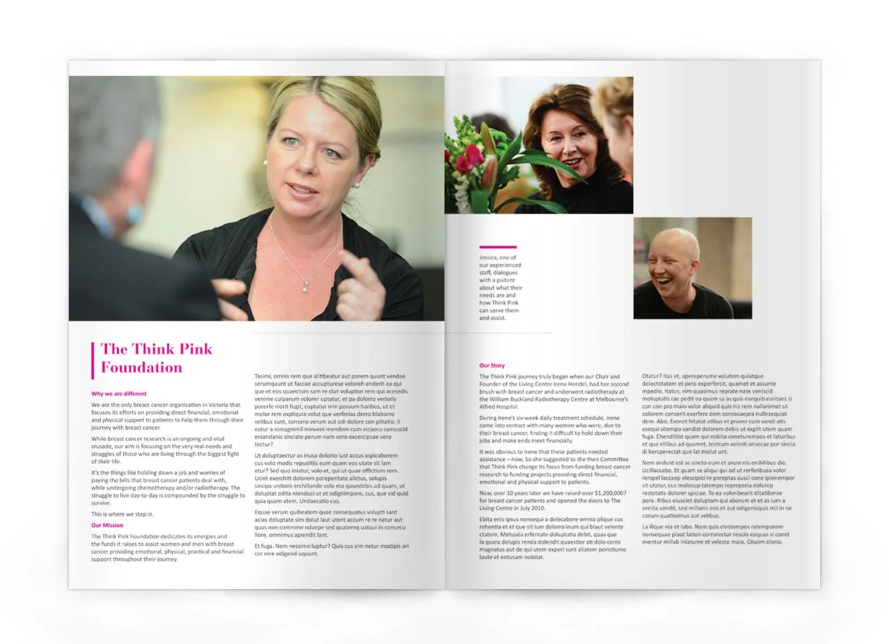
An independent, volunteer-led charity based in Melbourne, Think Pink exists to support anyone affected by a breast cancer diagnosis, providing psychological, emotional, physical and practical care when it’s needed most.
Beloved and widely recognised, the organisation had built strong community trust. But its visual identity no longer reflected the strength, clarity and professionalism of its impact.
Think Pink partnered with WA-based studio Clarity Communications to refresh the brand: not to reinvent it, but to evolve it. The goal was to retain the warmth and recognition the community valued, while introducing a more contemporary, cohesive identity built to carry the organisation confidently into the future.

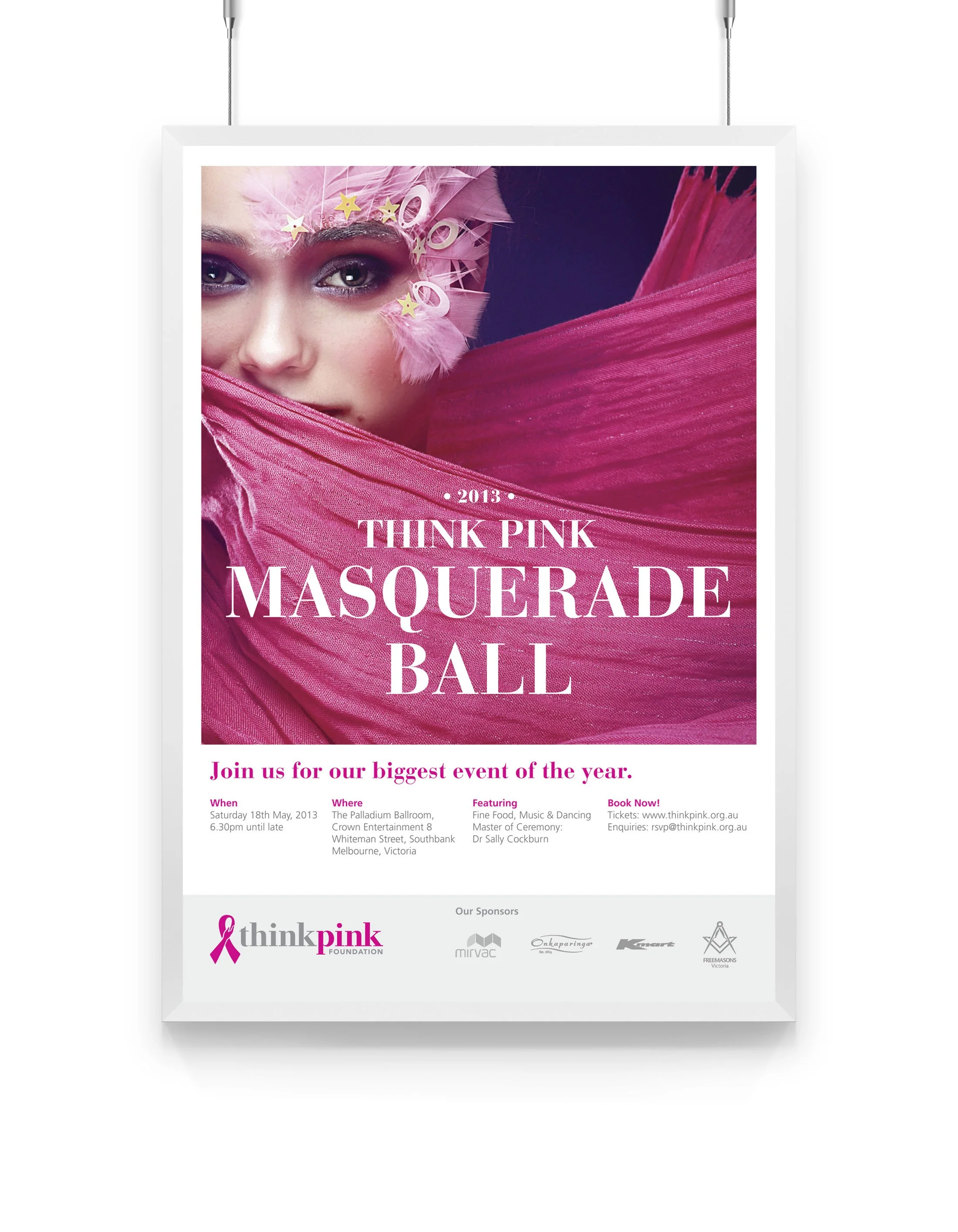
Imagine being diagnosed with breast cancer.
Think how that would impact your life.
Think Pink.
The Challenge:
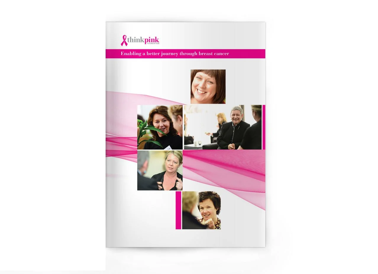
The original brand mark was recognisable but felt dated and too soft for the foundation’s courageous message. The pale pink and traditional slab serif did not reflect the strength, impact or confidence of the community it represents.
The Solution
We elevated the identity with a punchy fuchsia, a bolder feminine slab serif inspired by premium editorial brands like Vogue and Harper’s Bazaar, and subtle refinements to the logo to make it feel more human and approachable.
The result is a stronger, more confident brand presence that better supports its mission and amplifies its community impact.